Make diff file view easier to use on mobile screens
Viewing diffs on a mobile screen is a bit of an awkward experience at the moment. Here are a few issues (by no means complete):
Before
Tabs are scrunched
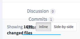
Filenames take too much room, buttons cluttered

After
This MR makes a few tweaks to make this a bit better. It just addresses a few issues, but there is plenty of room for improvement (e.g. shrink fonts, etc.):
Eliminate padding to make tabs fit

Make filenames, buttons more readable
This screenshot allows the filename to use the whole row, omits the file mode changes, and puts the buttons centered in the view:

Towards a better mobile experience: #2787 (closed)